Q1) What have I learnt from my audience feedback?
Cinematography:
I have received consistent positive feedback from my target audience about how the selection of shots that I have used conform to the typicality of my hybrid genre; the various close ups reflect my protagonist’s facial expressions and reactions to the number of actions happening within specific scenes. The cinematography was also prevalently referred to as “fittingly in focus” which was what I was intending to create. The ultimate range of shots that were taken shows my skillset with the camera and produced a “clean” and “tidy” sequence. On the other hand, a couple of comments were made specifically about my tracking shot from behind of the main protagonist; it was observed as being “in and out of focus”. However, interjecting against this statement, I believe that personally it creates an ominous atmosphere with each step the character present makes, the camera blurs a little indicating an disequilibrium approaching the storyline; which was also quoted within my audience feedback from some other individuals. Another optimistic overview of my final product was the how the narrative depicted from the cliché ‘good vs. evil’ characters and how the narrative was fluid throughout, beginning with a blithe tone to reflect innocence within Shannon (main protagonist) meanwhile still up keeping an ominous back lay to constantly create tension. Contextually, this would not easily identifiable due to the fact that a dark undertone to the film needed to be apparent during the disequilibrium of the film, making it hard to anchor audiences. Despite this, my demographic took an increasing understanding to the narrative, the more they watched so overall, my cinematography feedback was very successful.


Mise en scene:
In terms of the mise en scene, my audience depicted the woodland theme to be ‘increasingly menacing’ and ‘unnerving’, again, successfully fitting into my cross genre of thriller/adventure/fantasy. I particularly agree with that statement as it is a commonly used setting within other horror and thriller movies and products with the connotations of jump scares and the gradual building of tension to reach a final climax. This would make the mise en scene of my short film, conventional of the darker, gothic genres of film. The lighting also played a huge part in creating this ‘unnerving’ approach with the use of shadows and heightened reds. Furthermore, there were some very interesting constructive criticism comments about my character’s “simplistic” and “casual” attire worn. I partly agree to this idea due to the fact that the actress had pulled out on short notice so this could have been thought through a little more in depth. On the other hand, this casual look can be seen to bring about her innocence and sense of insecurity, while also making it apparent that this is a modernized film notion. Moving back onto the heightened reds throughout the film, audiences immediately recognized this and related it straight back to the folktale ‘Red Riding Hood’ which had inspired me within my planning and research stages. A further criticism that was called to my attention was the time of day that I chose to film and that if left a little later into the evening, this may have added to the contribution of dark, gothic and thriller aspects. I agree with this to a certain extent but due to the season and month I was shooting in, left too late would have caused me to stop filming and perhaps even have to delete shots that were not as clear as earlier ones taken. Personally, any darker would have dulled the shadowed tones and the heightened reds would have been observed to be over saturated against extremely dark backings.
Narrative:
“Appropriately vague” was one particular comment that I had received back from my audience feedback in this area. This was my exact intention to keep my demographic guessing in the duration of the film until the final stages and the villain revealing. Mystery and the unexpected was a key feature in my film and I definitely wanted the ending stages to be open to interpretation for each individual. In some cases this may have been seen as confusing with the story perhaps not coming to a complete end, however, I am insistent about having open interpretations about the final stages.
Codes and Conventions:
Overall, my final product was consistently referred to as “unconventional” to the genre. This is due to the fact that this is a hybrid cross genre and contains elements and features of all genres included, making this a challenging narrative to follow. On the other hand, audiences also frequently spoke about how some conventions of genres were actually met; such as the dark droning and tonal change with each scene, reflecting a gothic and thriller piece. Additionally, viewers shared that my film ‘breaks and makes conventions at appropriate areas in the product’.
Representation:
With the use of only one actress in my main task, I wanted to create two personalities within her which brought about two differing and juxtaposing representations; both antagonistic and protagonist elements. ‘Both’ characters separately track a typical archetype; for example Shannon (protagonist) is easily identifiable to audiences as a victim against the antagonist who is portrayed through a dark light and at the climax of the film. I therefore, fully agree that the character is challenged, as she is an antithesis to convention.
Sound design:
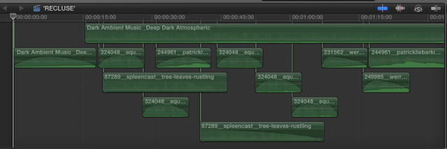
This was reflected in my audience feedback as one of my strongest assets that coincided perfectly with all tonal drifts and scene changes. I used Freesound.com to create tension build-ups. This was definitely the most time consuming aspect of the production of my film due to the fact that I actually created the music following my shots, from individual audio effects and composing them all together to create an extremely tense outlook on the filmed shots.

Ancillary feedback:
Poster:

Photography:
I am extremely pleased with the audience feedback for my final poster design due to the fact that it was a long process of editing and typography was carefully selected to coincide with my theme. This poster was referred to as “professional” and “clear and concise”. I would have to agree with this feedback as this was the outcome I was hoping for. This poster is made up of two separate photographs that were taken on two separate photo shoots. Each photograph shown below:
The editing process of merging these two photographs together was done with the use of masked layers, the vivid light tool and the stamp clone tool to reconstruct the hidden elements of my model’s face from behind the leaf. Each photograph is representing her personality; the evil alter ego vs. the innocent. The photography was described as ‘very well fitting’ and ‘reflective of the mise en scene’ within the edited hair.
I wanted to keep the continuity of heightened reds throughout my products however; also keeping them low key and subtle to anchor my audiences further.
Narrative:
In terms of narrative, it was observed to be extremely clear and ‘to the point’, reflecting onto the horror/gothic genre moreover any other. I would agree that the narrative in the poster is very clear and conforms to the genre it is suitable for. An entropic narrative is based on the fact that my product is gynocentric; it is known to be a rarity that an all female cast is presented in a film, and therefore challenging conventional representation of a dominant male
Typography:
This was another strong area for my poster according to my audience feedback. It is concise, clear and values an identity that can be easily recognizable to my primary audience.
Magazine:

For my magazine double page spread I have received a lot of positive and optimistic feedback that I will be taking on board as well as some criticism that could be changed for a further products in the future. My overall design was described as “professional”, likewise to my poster, as well as driving “portentous” tones onto my demographic. The photography created and conforms to the horror genre in particular due to the opacity of the chosen merged close up shot of my character. The left hand side of the close up was identified by my audience as to having connotations with a skull, which is a direct representation of horror features. The layered pictures presented on an ominous background creates depth and contrast with the darker tones towards the back of the photograph; in turn, allowing the face to ‘pop out’ from the page a catch audience’s eyes and anchor them to the film review.
Composition:
The overall composition had some criticism as my column was cut shorter than an ordinary film review due to the sneak peak image of the director shooting the film; I incorporated this because I felt that it would give the magazine a more exclusive and personal feel to it. However it did take up a lot of space where my review was placed. I can agree and disagree that the placing of the photo could have been decided more thoroughly. On one hand it would have spared up space to write a more in depth review however arguably, this may have been interpreted as an introduction with more text about the film further into the magazine; either way I can understand both ideas.
Typography:
I wanted to keep the continuity between my film poster typography and my magazine text so that my products would all be familiar to my primary audience. Unfortunately due to the fact that I created the ‘Recluse’ font title on my poster, I had some technical difficulties in recovering the font from that file. Knowing this, I decided to compromise with a similar font however not as closely identified to the previous as I would have liked and this was picked up by my audience feedback.


